Apple is quietly admitting its Liquid Glass redesign wasn't perfect. With iOS 26.2 out now, users get granular controls to dial back the transparency on their Lock Screen clock - the second time in as many updates that Apple has given people an escape hatch from the semi-transparent design language that divided users since launching in iOS 26. The timing raises questions about whether Apple's bold design overhaul can survive without its original architect.
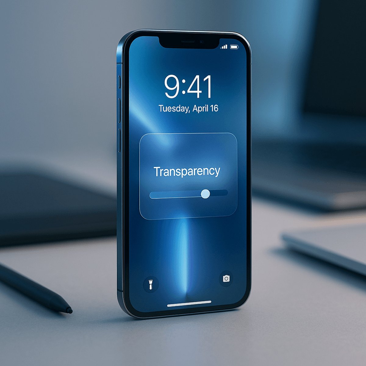
Apple isn't backing down from Liquid Glass entirely, but it's definitely backing off. The company's iOS 26.2 update, released Friday, introduces another transparency control - this time specifically for the Lock Screen clock - letting users dial down the "glassiness" if it's making their display harder to read.
This is the second time in two software cycles that Apple has given users an out from the design overhaul that was supposed to modernize the entire iOS experience and prepare devices for a potential future of AI smartglasses. When Liquid Glass launched with iOS 26 in June, it transformed interface elements like buttons, sliders, and notifications into semi-transparent, light-refracting components that looked sleek in demos but proved problematic in real-world use.
The backlash was immediate. Users complained that notifications became hard to read, artist names in Apple Music disappeared into the translucent backgrounds, and the whole interface felt more like a design statement than a functional operating system. "Some found that the transparency made their device difficult to use," according to TechCrunch's reporting, and Apple listened.
In iOS 26.1, the company introduced a system-wide slider that let users shift the entire interface toward a "frosted" look - essentially admitting that perfect transparency wasn't actually perfect for everyone. Now iOS 26.2 goes further, offering granular control over individual elements. The Clock widget specifically gets its own transparency slider. This isn't a global retreat; it's targeted customization that lets Apple keep Liquid Glass as the default while giving friction-averse users a path to readability.
But here's where it gets interesting: the timing of this rollback coincides with a major leadership shift in Apple's design division. Alan Dye, the executive who championed and designed Liquid Glass, left the company earlier this month for Meta, where he'll lead a new creative studio within Reality Labs. Apple didn't paint it as a departure born from design differences, but replacing Dye with Stephen Lemay - a career interface and interaction designer - sends a message. Lemay's skill set is the antidote to Liquid Glass problems. His expertise is in making things usable, not conceptually bold.
The optics matter here. When a design executive leaves right as their marquee feature gets walked back, it reads as either vindication of user feedback or a vote of no confidence in the direction. Either way, Apple is clearly recalibrating. Instead of forcing everyone into Lemay's aesthetic vision, Apple is handing control to users, which is both pragmatic and an implicit acknowledgment that not every design choice needs to be universal.
Beyond Liquid Glass tweaks, iOS 26.2 bundles in a range of feature updates that show Apple is still iterating rapidly. Users can now create AirDrop codes for sharing files with people outside their contacts - useful for workplace collaboration without cluttering your address book. Reminders now supports alarms, a surprisingly long-overdue addition. Apple Music added offline lyrics support. Podcasts got AI-generated chapter markers and a new Mention feature for cross-promoting shows. Apple Watch users got Sleep Score tracking.
And then there are the security updates. On the same day, Apple released emergency patches across iPhones, iPads, Macs, Apple TVs, and Apple Watches to close vulnerabilities being actively exploited in hacking campaigns. That's the kind of news that typically dominates the cycle, but it's being overshadowed by the Liquid Glass story - a sign of how much the design overhaul has captured industry attention and skepticism.
The broader implication: Apple is willing to soften even its most confident design statements when users push back. Liquid Glass isn't being abandoned, but it's being democratized. Users get to choose how much design revolution they want. Whether that flexibility represents maturity or capitulation depends on your perspective, but it signals that Apple's new design era might look different under Lemay than it did under Dye - more user-centric, less artistically doctrinaire.
The Liquid Glass story is really a story about how even Apple, a company known for forcing design choices on users, recognizes when it needs to yield. Two updates into the rollout, the company has built an escape hatch into its flagship feature. That's not failure - it's actually maturity. The departure of Alan Dye and arrival of Stephen Lemay suggest Apple is ready for a design philosophy that's bold but flexible, modern but usable. The question now is whether this more measured approach extends beyond Lock Screen controls to the broader identity of iOS in 2026 and beyond.