Microsoft is pulling back the curtain on its design process, revealing the rejected icon concepts that almost made it into the final Office suite refresh. The company experimented with radically different approaches for Word, Excel, and PowerPoint before settling on the curvier, more colorful designs now rolling out across Windows and iOS.
Microsoft is giving us a rare glimpse behind the design curtain. As the company rolls out its latest Office icon refresh across Windows and iOS, it's sharing the concepts that didn't make the cut - and some of them are surprisingly bold.
The rejected designs tell a story of creative experimentation that went far beyond the safe, incremental updates we typically see from major software companies. Instead of playing it safe, Microsoft's design team explored concepts that would have fundamentally changed how millions of users recognize their favorite productivity apps.
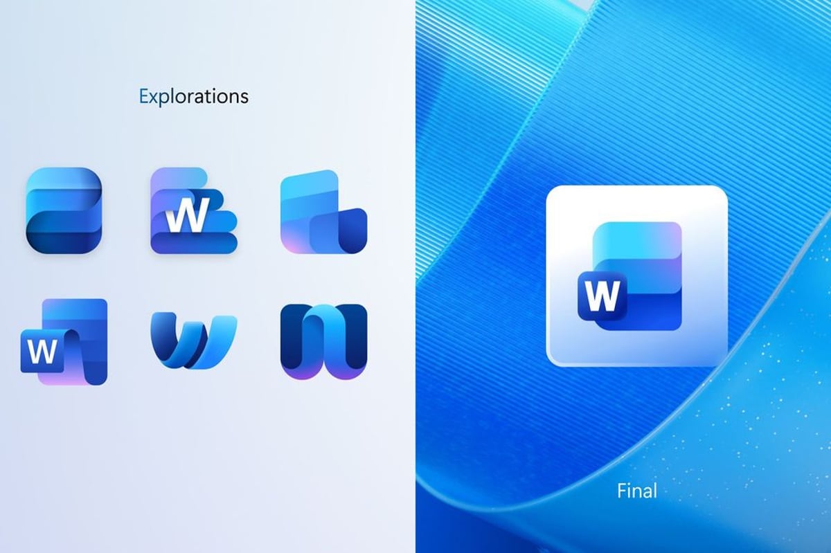
For Word, the experiments were particularly adventurous. The concepts shared on Microsoft's Instagram show notepad-inspired designs and various ways to visualize stacks of paper or documents. Some versions made the "W" lettering the star of the show, while others experimented with blending the letter into the background or removing it entirely. The final design Microsoft settled on features three horizontal bars instead of four, available in both lettered and letterless versions.
What's fascinating is how some of these concepts harken back to Office for Mac icons from the past, suggesting Microsoft considered a nostalgic approach before deciding on its current direction.
Excel's rejected concepts stayed more true to form, heavily focusing on cell visualizations that have defined the app's identity for decades. But there were standout experiments, including an intriguing X-focused design that caught attention for its simplicity and boldness. Most of the other concepts ended up looking similar to the final shipped version, suggesting Microsoft had a clearer vision for Excel from the start.
PowerPoint's design journey was perhaps the most adventurous. The app has always been about slides, but Microsoft experimented with creative interpretations of that concept. Some designs transformed the P into a ribbon-like element, while others incorporated pie charts directly into the letter P - a clever nod to the presentation charts that define so many PowerPoint decks. The final design took a more conservative approach, offering a rounded and colorful evolution of the current PowerPoint icon rather than a revolutionary redesign.
The rollout strategy reveals another interesting design decision. Microsoft is using lettered versions of the icons on Windows but opting for letterless variants on iOS. This platform-specific approach suggests the company recognizes different user expectations and design conventions between desktop and mobile environments.
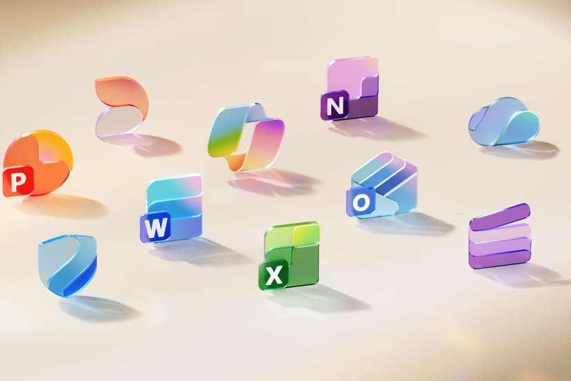
The broader Office suite refresh includes new designs for Teams, OneDrive, Outlook, and OneNote, all part of Microsoft's push toward more unified visual branding across its productivity ecosystem. The timing coincides with the company's broader push into AI-powered features and cloud-first experiences.
What makes this peek behind the curtain particularly valuable is how it illuminates the tension between innovation and recognition in icon design. These apps serve hundreds of millions of users who've built muscle memory around visual cues. Push too far, and you risk confusing longtime users. Play it too safe, and the brand feels stagnant.
Microsoft's decision to share these rejected concepts suggests confidence in their final choices while acknowledging the creative risks they considered. It's a rare moment of transparency from a company that typically keeps design decisions tightly controlled until launch.
Microsoft's willingness to share these rejected concepts offers a fascinating window into how major software companies balance creative risk-taking with user familiarity. The final Office icons we see today represent not just design choices, but strategic decisions about how far a brand can evolve without losing its core identity. As the rollout continues across Windows and iOS, users will be the ultimate judges of whether Microsoft struck the right balance between innovation and recognition.