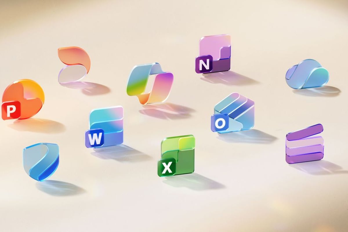
Microsoft just dropped its first major Office icon redesign in seven years, trading sharp edges for colorful gradients and fluid curves. The refresh affects all 10 core Microsoft 365 apps and signals the company's push to integrate AI-powered Copilot deeper into its productivity suite. For millions of daily Office users, it's the most visible change to hit their desktops since 2018.
Microsoft just gave Office its biggest visual makeover since 2018, and the change couldn't be more obvious. Gone are the sharp, geometric icons that have defined Word, Excel, and PowerPoint for the past seven years. In their place: vibrant gradient colors, soft curves, and what the company calls "playful motion."
The timing isn't coincidental. This redesign comes as Microsoft doubles down on integrating Copilot AI across its entire productivity suite, and these new icons are meant to reflect that shift. "The new icons emanate a sense of fluidity and play, while also being simpler, more intuitive, and highly accessible," Jon Friedman, corporate vice president of design and research for Microsoft 365, told Microsoft Design.
The most striking change? Color gradients that would make even Google jealous. Where Office icons once featured subtle gradients, they now sport what Friedman describes as "richer and more vibrant" transitions that improve contrast and accessibility. It's a bold departure from the clean, flat design that dominated the 2010s.
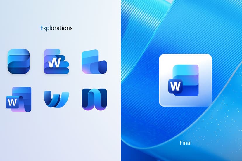
But this isn't just about aesthetics. The redesign tackles real usability issues that have plagued Office for years. Take the Word icon - it previously used four horizontal bars that became nearly illegible on mobile screens. The new version uses three bars, making it instantly recognizable even on a smartphone notification.
"We've moved away from bold, static solidity to embrace softer, more fluid forms," Friedman explains. "Sharp edges and crisp lines are replaced by smooth folds and curves, giving the icons a sense of playful motion and approachability." It's design language that mirrors the company's broader shift toward AI-assisted workflows.
The changes affect all 10 core Office applications, from the familiar trio of Word, Excel, and PowerPoint to newer additions like Teams and OneNote. Each icon maintains its core identity while adopting the new curved aesthetic that Microsoft says was directly inspired by the Copilot icon design.
For enterprise customers, this represents more than a cosmetic update. The unified design system signals Microsoft's commitment to creating a more cohesive experience across its productivity tools, something that becomes increasingly important as companies adopt hybrid work models and rely more heavily on digital collaboration.
The rollout begins in the coming weeks across web, desktop, and mobile platforms for both consumer and commercial Microsoft 365 users. Unlike previous Office updates that sometimes took months to reach all users, this visual refresh appears designed for rapid deployment across Microsoft's entire ecosystem.
What's particularly interesting is how this connects to Microsoft's broader AI strategy. These aren't just new icons - they're visual cues for a productivity suite that's increasingly powered by artificial intelligence. As Copilot becomes more integrated into daily Office workflows, these redesigned icons serve as gentle reminders that you're working within an AI-enhanced environment.
The market reception will be telling. Previous Office redesigns have generated mixed reactions from users who prefer familiarity over innovation. But with remote work pushing more collaboration into digital spaces, and AI assistance becoming table stakes for productivity software, Microsoft may have timed this refresh perfectly.
Microsoft's Office icon refresh represents more than visual polish - it's a strategic signal that the productivity suite is evolving into an AI-first platform. While some users may resist the change from familiar geometric designs, the improved accessibility and mobile legibility address real usability pain points. As Copilot AI becomes more central to how people work, these vibrant, curved icons serve as visual anchors for a fundamentally different Office experience. The real test will be whether users embrace this softer, more approachable design language or long for the crisp professionalism of the previous generation.